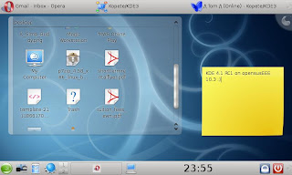
Now down to what's important. KDE 4.1 is clearly becoming a very polished desktop! Folderview rocks, and once the desktop alpha thing is fixed ( not sure what else to call it ). The idea of that is so kewl, its much better that a standard icon desktop, since you can do so much more. If you really want an icon wasteland, u can have one, but i like order on my desktop ( sadly my wife is using the laptop for work until we get a pc, so she dumps everything on the desktop ). The desktop zoom out, add activity is kewl. It doesnt really appeal to me, purely cause i'm not a multidesktop person, but if i was i can see why it'd use it. Kopete still doesnt seem ready ( crashed after a few mins ), but Kopete for KDE3 still works great :) That aside, I can see where kopete for kde 4 is going and I like it. Its gonna be very difficult for me to choose between digsby and kopete. Maybe i should write another post about digsby, a really kewl im client with a lot of features ( making it far more than an im client ). Dolphin has been amazing since it was first put into KDE 4, so I dont need to say much more than if you are to replace konqueror as a file manager, dolphin is the only replacement i could accept. Since I mostly use the net and web apps ( and the EEE is pretty much made for that :P ), opera runs great on KDE 4 ( as expected ), which takes care of most of my needs. So after a few minutes playing around, I realised I was missing YaKuake. For anyone who uses the terminal a lot, maybe a programmer like myself, YaKuake is one of my killer apps. Its a Quake style drop down console. One button ( which I normally make ~ for nostalga sake ), and u have a term, which hides away with none of this alt+tabbing stuff :P With openSUSE one-click install, again it was done quickly, and all there :) Again, great job done to the KDE guys!!! The only things which i miss greatly are autohide panels ( since im on the EEE, 800x480 res and need all the screen space i can get ) and mac style menu bar at the top the of the screen, something I got used to before moving to Holland. Now for the screen shot spam.


Panel hiding is unfortunately not coming until 4.2, but I've found a better solution on my eee. I've removed teh panel completely, and added the widgets normally in the panel directly onto the desktop (I'm a no-desktop-icons guy so there's plenty of space), the I just use ctrl-f12 to reveal the plasma dashboard rather than un-hiding teh panel. works great for me.
ReplyDeleteThanks, great idea. I tried it and it work well. I really love the way plasma allows you to do that. We've been running KDE 4.1 beta for a few days now, and find it greatly stable, so I think I've finally kicked the 3.5x destop! Been waiting for this moment for year.
ReplyDelete